• Skip to primary navigation
  • Skip to main content
  • Skip to primary sidebar
  • Skip to footer

Music Matters Blog

Music Matters Blog

Inspiring Creativity

  • Home
  • About
    • Speaking
  • Blog
    • Business
    • News
    • Resources
    • Teaching
  • Store
    • Music Resources
    • Piano Arrangements
    • FAQ
    • Cart
  • Music Books for Kids
  • Contact
  • Search

Design Principle #1

September 15, 2005 by natalie Leave a Comment

Years ago, I attended a workshop on Design and learned some principles that have stuck with me through the years and been invaluable to me in determining how to design professional-looking materials for my studio. There are four basic design principles that I learned. I’ll devote a post to each one.

1. Proximity
Group related items together. As you look over a design, ask yourself how many times your eyes have to stop to absorb all the information. You should be able to quickly scan the information and have a clear idea of what is being presented. Keep in mind that your eyes tend to naturally follow a certain course as you look at a piece of paper. On a single page, your eye follows a “Z” pattern. On a double page, your eye follows a “V” pattern. These are illustrated in the following image:

I took this principle into consideration in the design of this brochure for one of our local associations. (Notice the placement of the photographs on the inside of the brochure.)

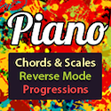
Sometimes it’s helpful to see a bad design so that the good design principle makes more sense. So, I decided to show you this flyer that I found that caught my eye because of how poorly it was designed. (I took out the business name.) You can see that the information does not flow clearly at all. It completely violates the principle of proximity (not to mention many others!). This is the type of flyer you could look at numerous times and still miss some of the information because it is so randomly placed on the page!

Avoid cluttering the space with too many different text areas or graphics. White space is a good thing and aids in a clear presentation. This can be applied to studio policy brochures, recital programs, business cards, etc. So, above all, remember that the information must flowly clearly to the reader.

Share this:

  • Click to share on X (Opens in new window) X
  • Click to share on Facebook (Opens in new window) Facebook
  • Click to share on LinkedIn (Opens in new window) LinkedIn
  • Click to share on Pinterest (Opens in new window) Pinterest
  • Click to email a link to a friend (Opens in new window) Email
  • Click to print (Opens in new window) Print

Related

Filed Under: Business, Computer Help

Reader Interactions

Leave a Reply

Your email address will not be published. Required fields are marked *

Primary Sidebar

Categories

Recent Comments

  1. Hamud Law Group on Financial Resources for Independent Music Teachers
  2. natalie on Organizing Rote Repertoire for Piano
  3. Patricia Backus on Organizing Rote Repertoire for Piano

Featured Collaborators

sheet music plus pass

carnival of the animals maestro classic

Virtual Sheet Music - Classical Sheet Music Downloads

MusicLink


Random Product

Recently Viewed Products

Footer

Free Resources

  • The Rhythm Randomizer – A Fabulous Free Tool for Piano Teachers
  • Amazing Photos of Deconstructed Pianos
  • Financial Resources for Independent Music Teachers
  • Piano Music for Left Hand
  • New Free Tortoises Beginner Piano Solo with Teacher Duet

Click for more Free Resources

Product Search

Blog Archives

Blog Categories

Advertisers and Affiliates

Teach Preschool Piano

Piano Companion App

Oktav Sheet Music Library

Moo.com

sheet music plus pass

maestro classics

Ecwid

Dropbox.com

RSS Feed | YouTube | Twitter | Pinterest | LinkedIn | Facebook | Email

Blog content by Natalie's Piano Studio | © 2005-2025. All Rights Reserved.
Sitemap | Privacy Policy | Terms and Conditions | Advertising Opportunities